



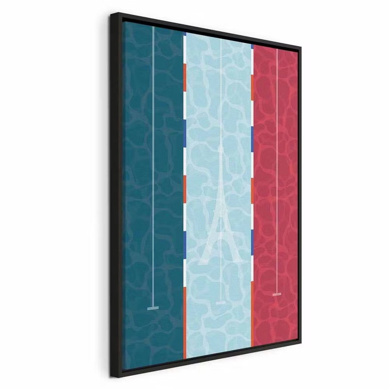
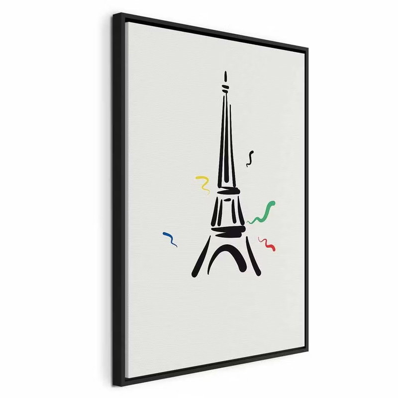

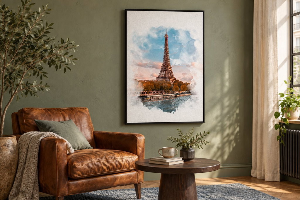
The Eiffel Tower in watercolour, silhouette and coloured ribbons
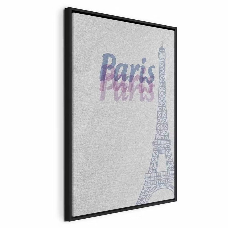
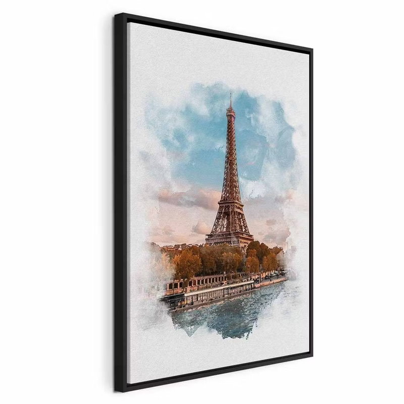
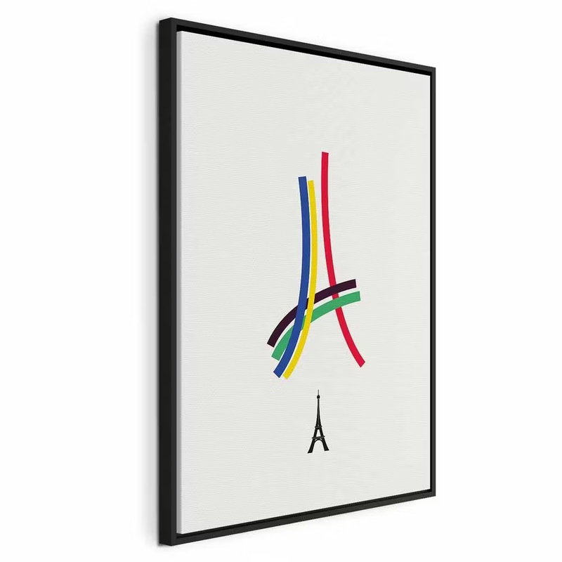
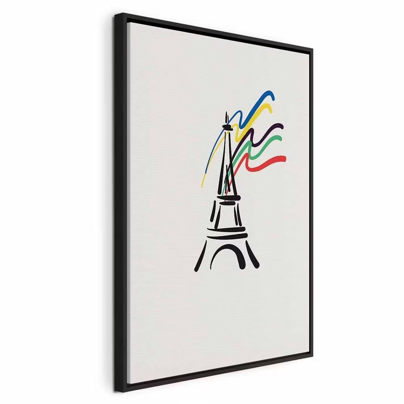
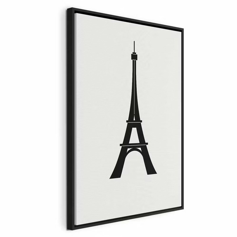
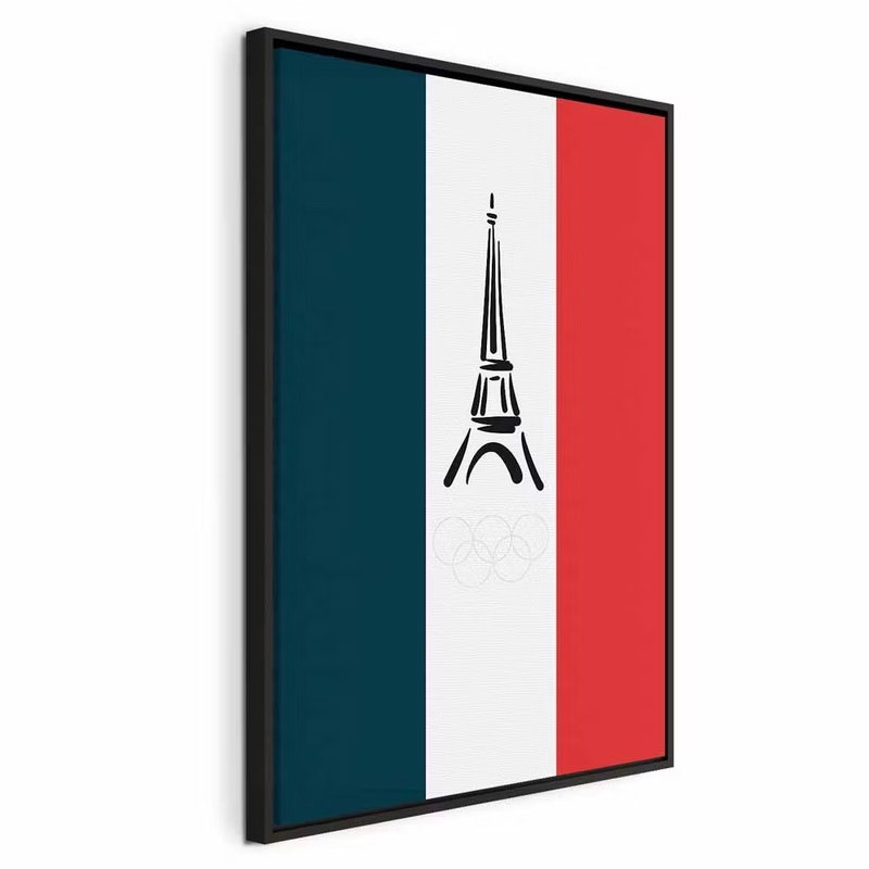
The same landmark can create very different impressions. In the watercolour print, the Eiffel Tower is surrounded by blue sky, warm trees and a riverside, with soft transitions into a pale background. Graphic interpretations instead work with the tower’s outline, black lines or coloured ribbons. Compare how much setting you want in the image and how clearly the tower should stand out from the other side of the room.
A Paris connection visible in the print itself
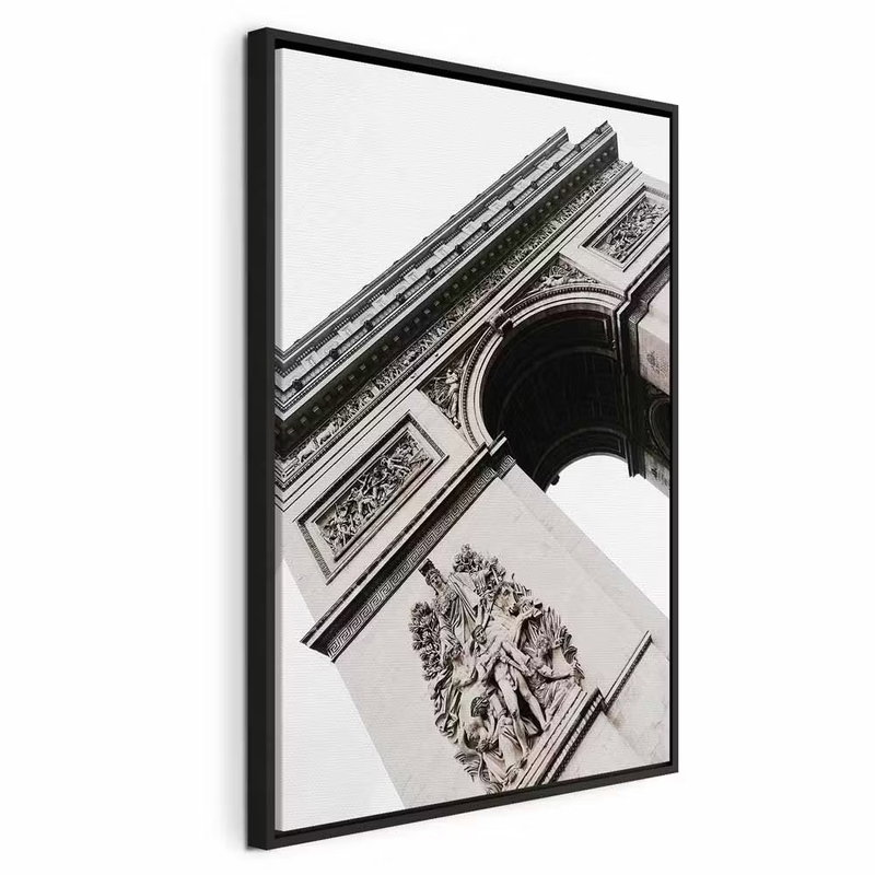
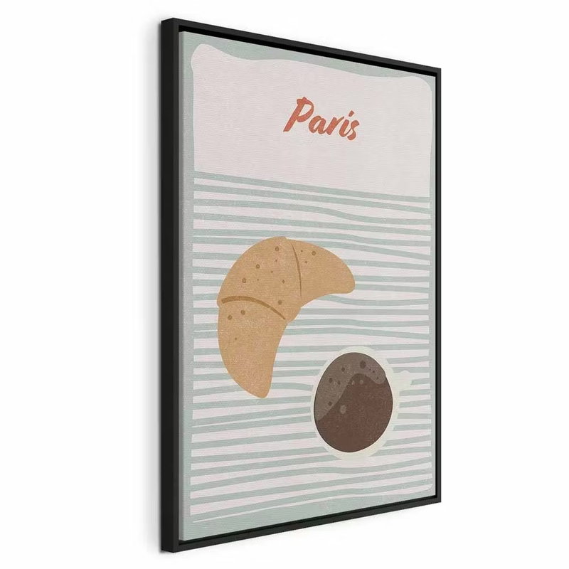
The selection also includes a black-and-white close-up of the Arc de Triomphe’s stone architecture and decoration. Other pictures combine the printed word Paris with drawn forms or breakfast illustrations. Here, the connection to the place is a visible part of the subject. If you want a recognisable city subject, consider which element creates your own connection to Paris. Examine the whole product image when choosing between a specific building view and a freer travel-inspired print.
Choose a frame that works with the open areas
Several graphic Paris prints leave broad pale areas around the tower. A visible outer frame gives the composition a defined edge against the wall. It can pick up the dark strokes in the image or relate to wood tones in the room. Check frame options on the product page; not every subject necessarily offers the same choices. Choose size according to how the image and its open areas work together, rather than considering landmark detail alone.
One Paris picture or a considered group
A portrait picture can suit a narrow wall area beside a seat or between two pieces of furniture. When combining images, the watercolour’s blue and warm tones can meet a simpler line drawing. Leave enough wall between the frames for each composition to remain readable. Measure the actual outer dimensions and follow the installation instructions for your chosen product and wall type.
Consider the room’s need for sound absorption too
Sound-absorbing material behind the print can help reduce reverberation within the room. The image’s connection to Paris does not imply any particular acoustic performance. Compare product construction and dimensions, and consider total absorbing area alongside furniture and other surfaces. A decorative picture does not replace sound insulation between rooms; choose the amount and position according to how the actual space is used.