





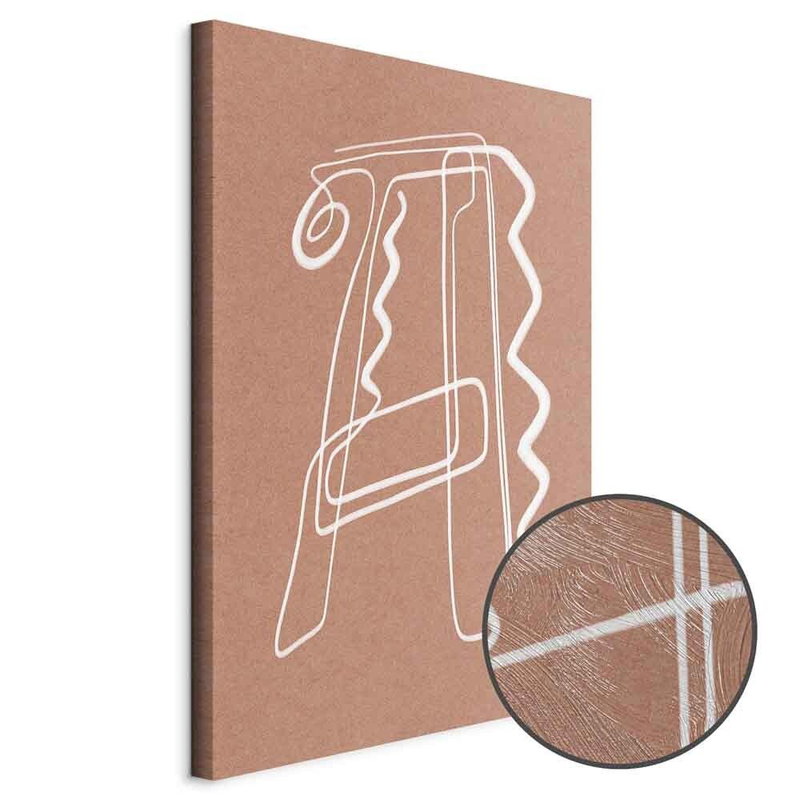
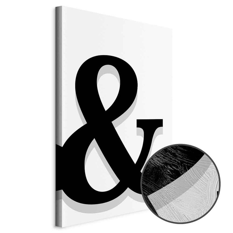
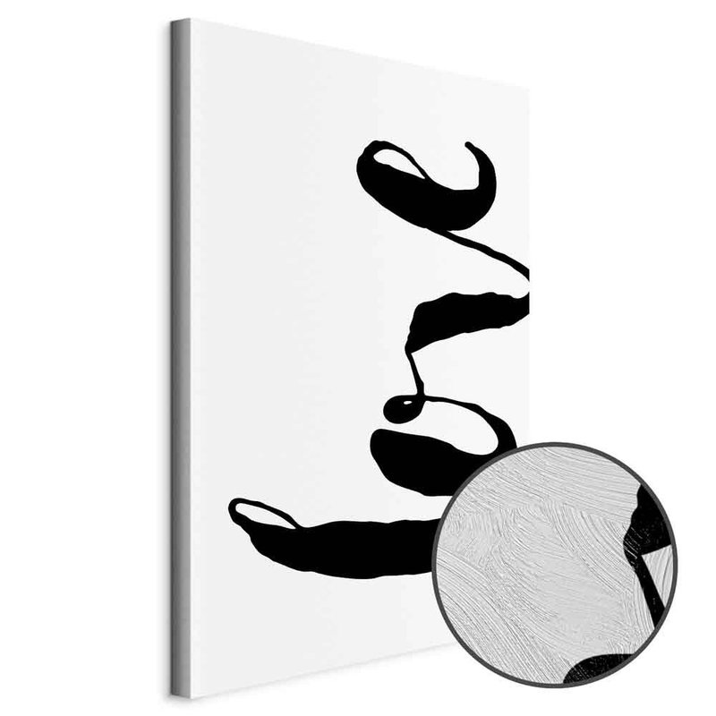
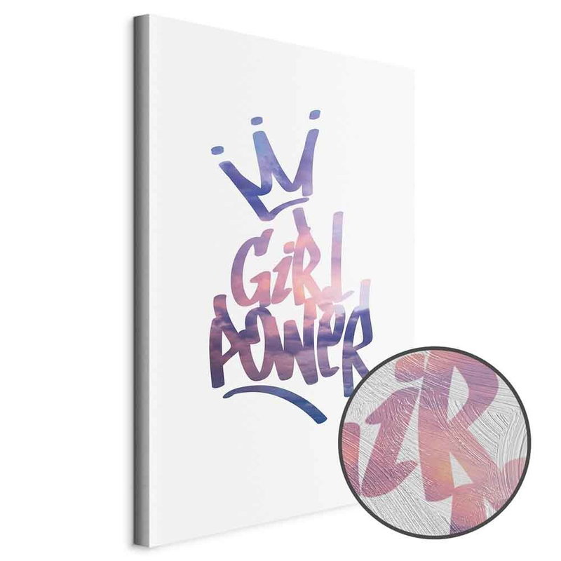



Choose words suited to the setting
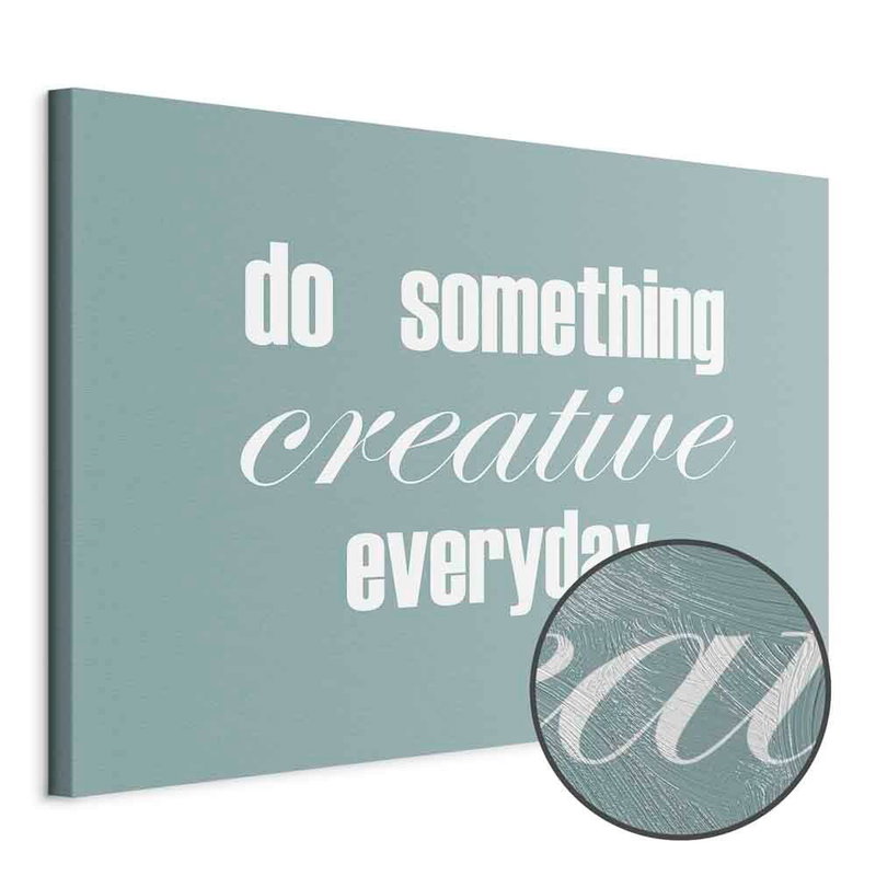
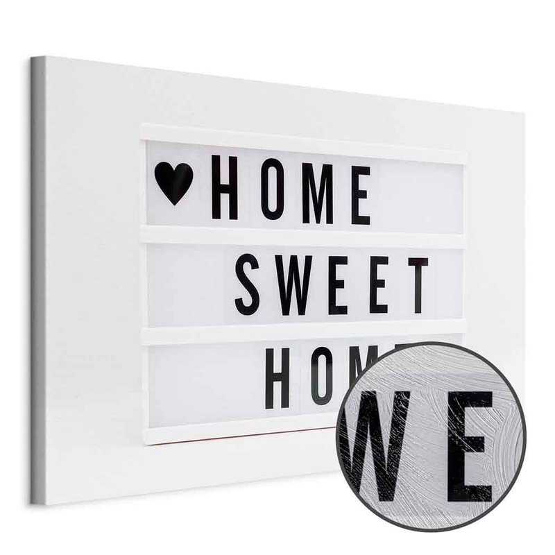
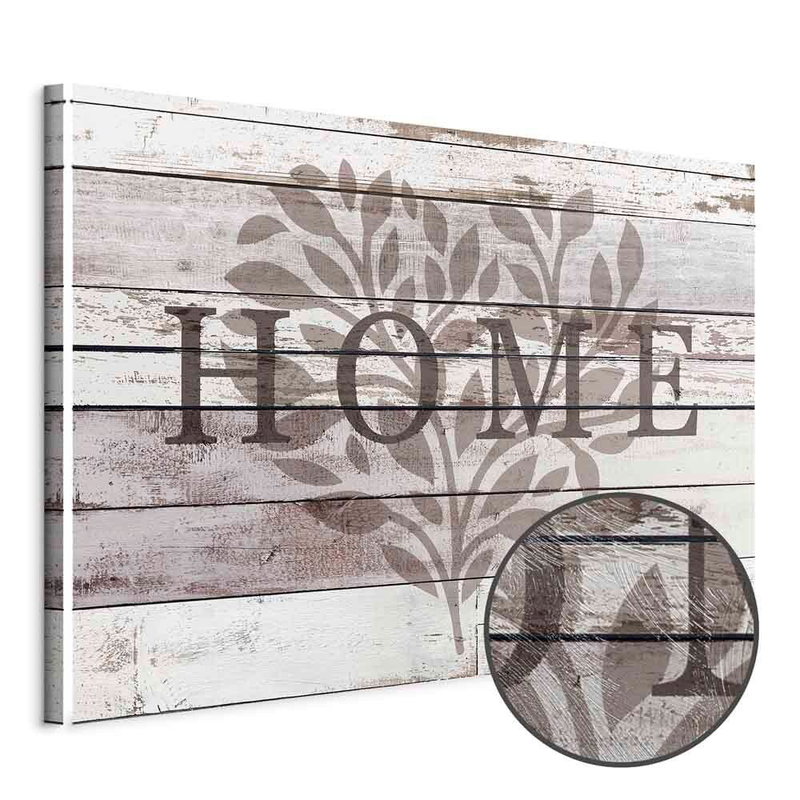
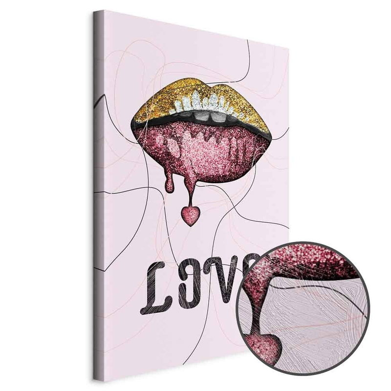
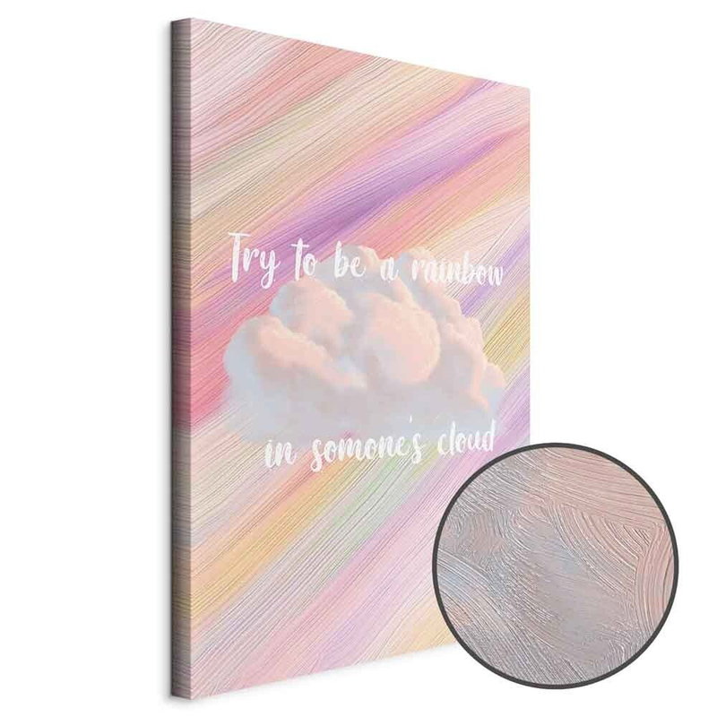
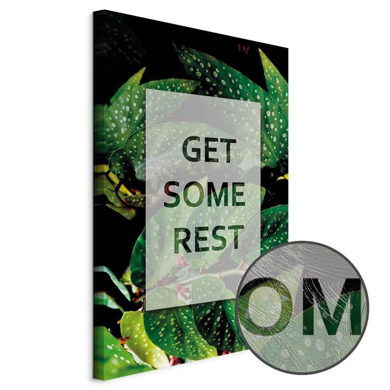
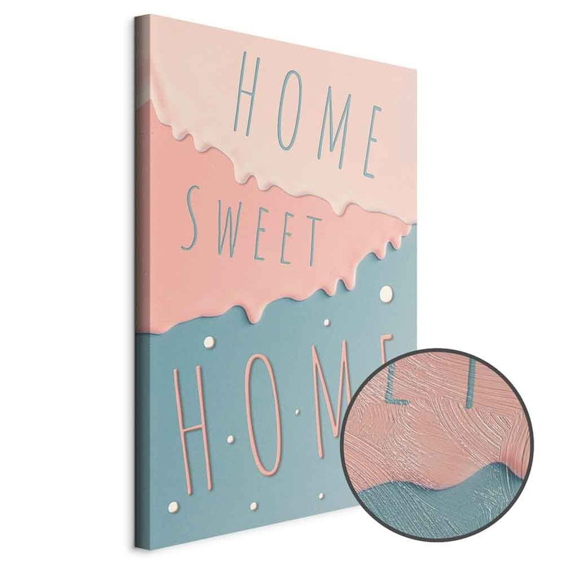
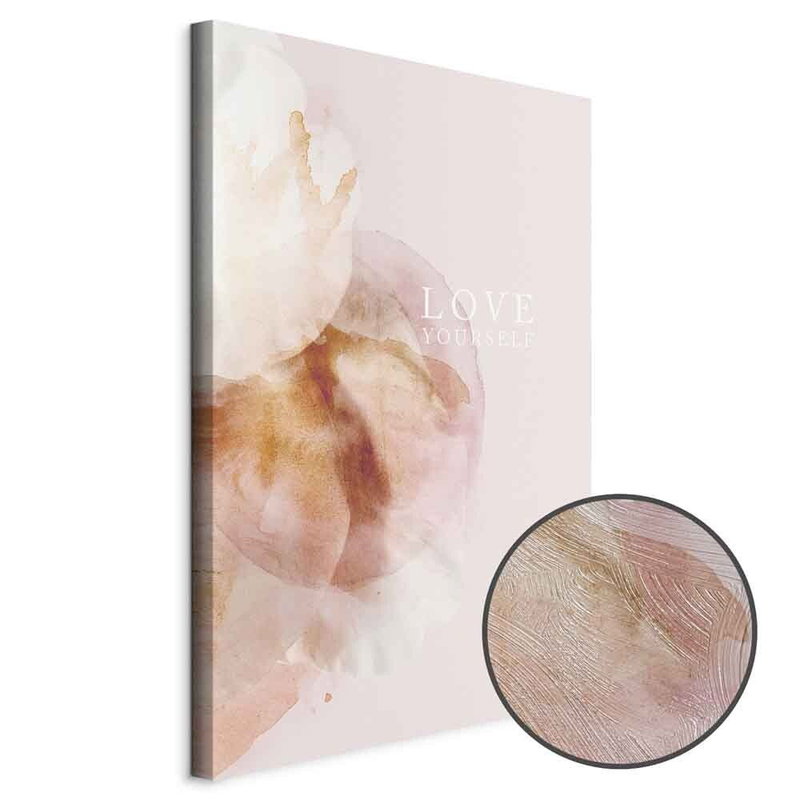
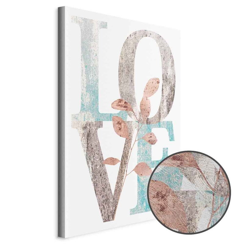
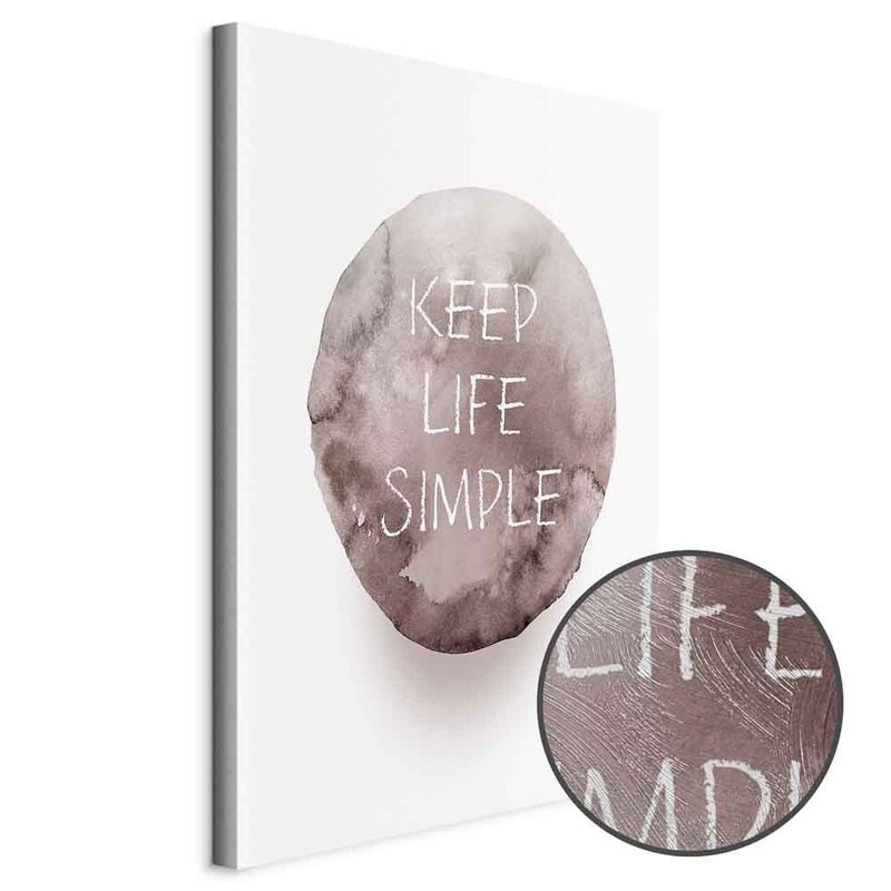
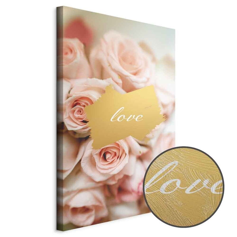
A short word can set a quiet tone, while a longer quote takes more space visually and in meaning. The range includes simple word designs, messages about home and love, and graphic gaming text. Consider who uses the room and the message you want to see each day.
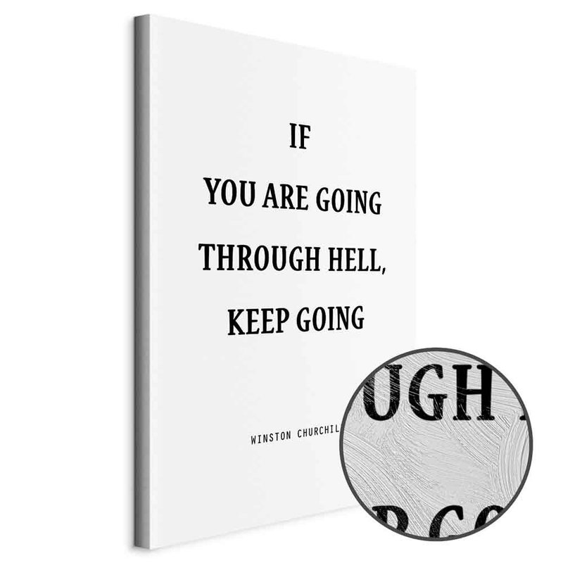
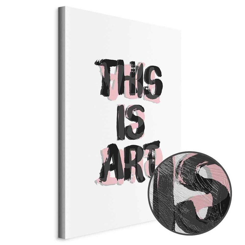
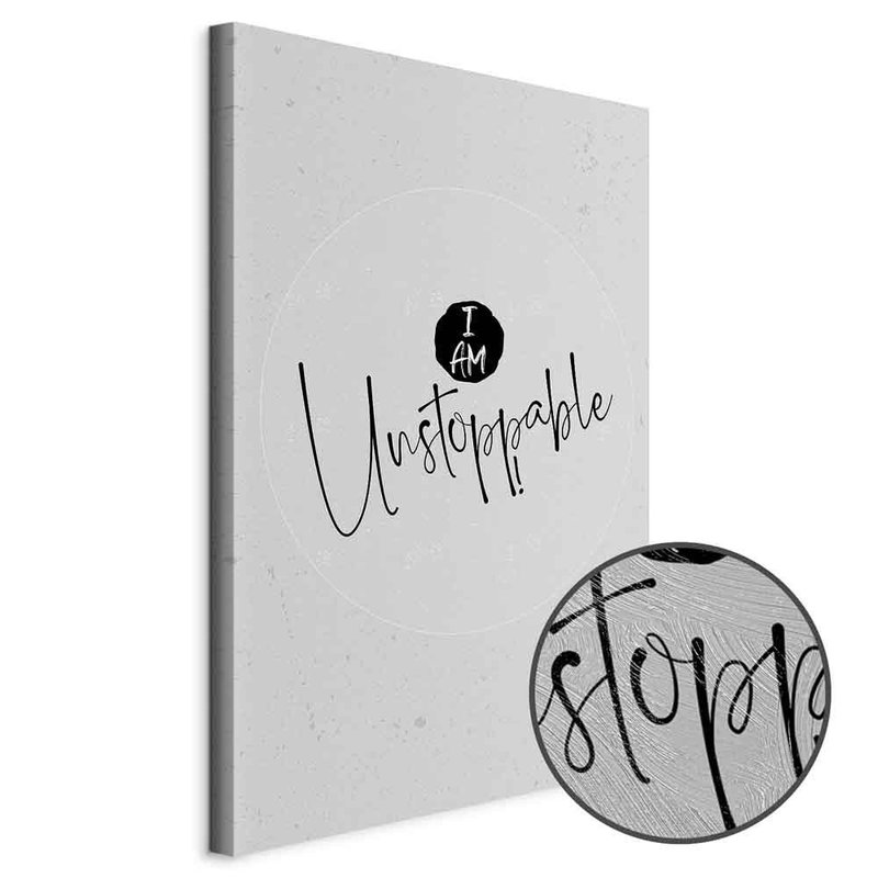
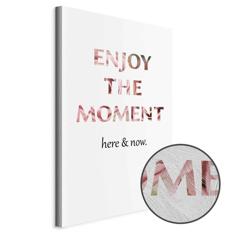
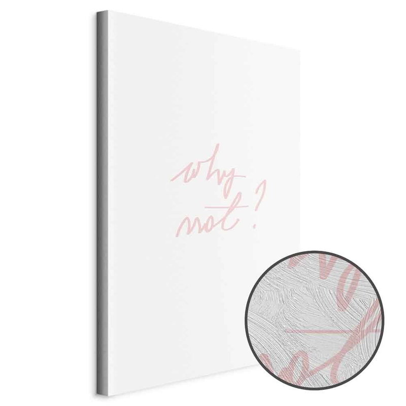
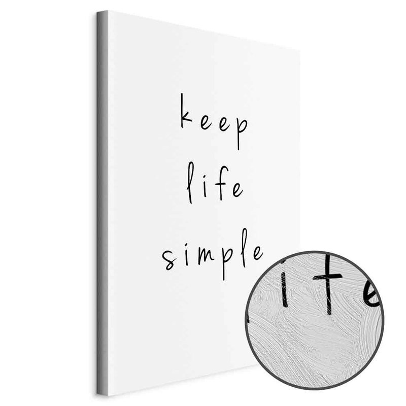
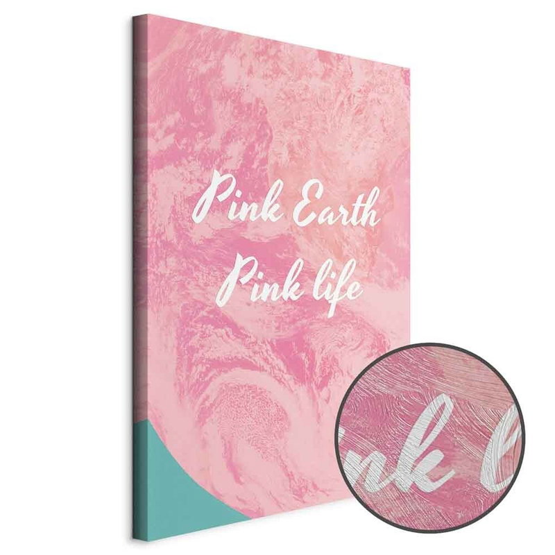
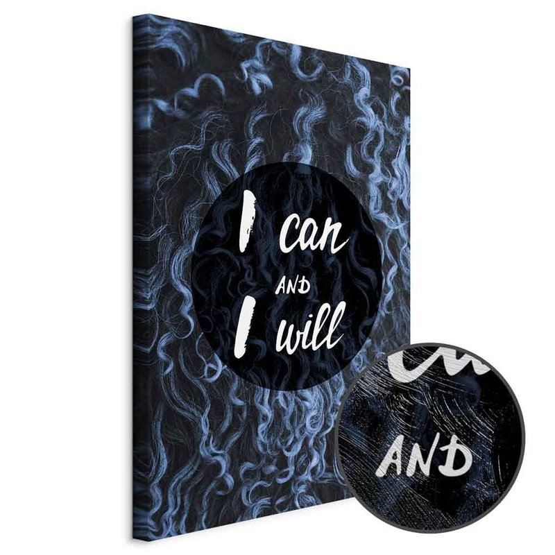
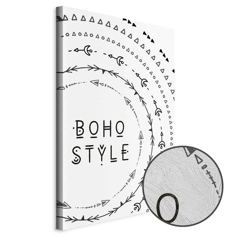
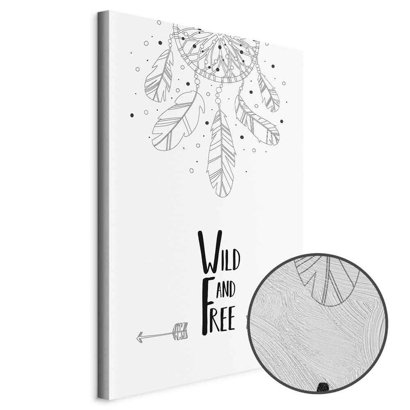
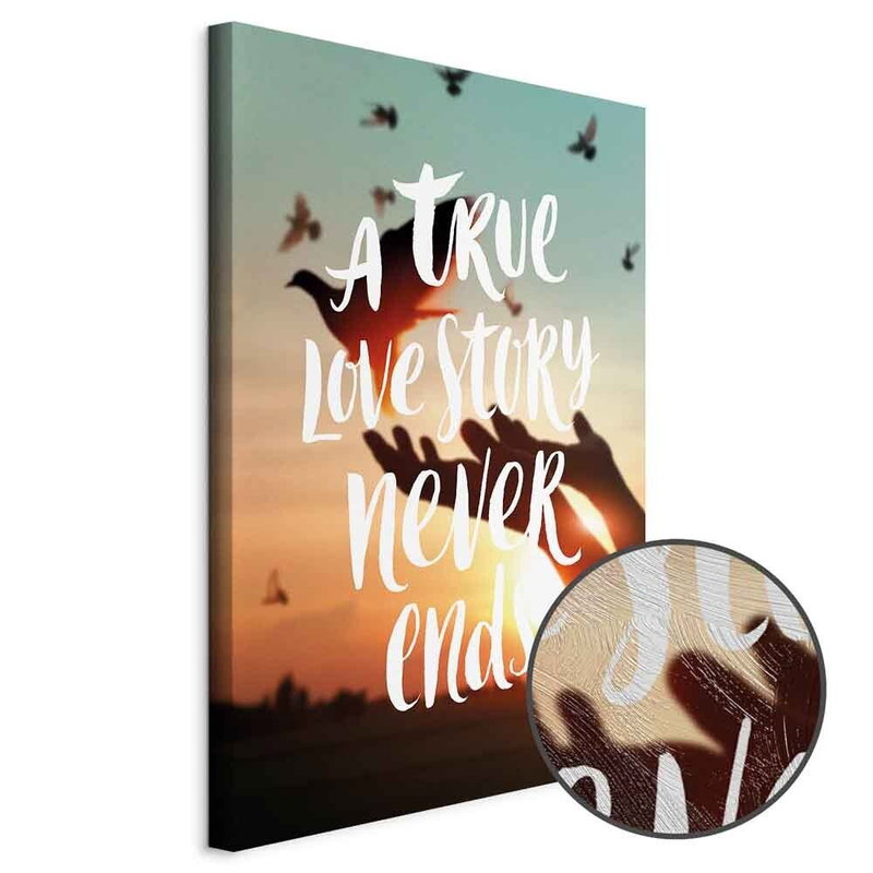
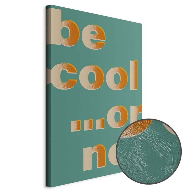
Read the actual artwork before choosing. The language in the picture is part of the print and does not change when you switch the shop language. Translating a category therefore does not translate the pictured wording. Check the complete phrase on the product image, especially where the letters are small or decorative.
The shape of the letters matters
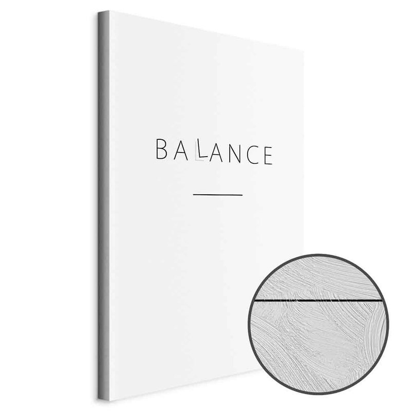
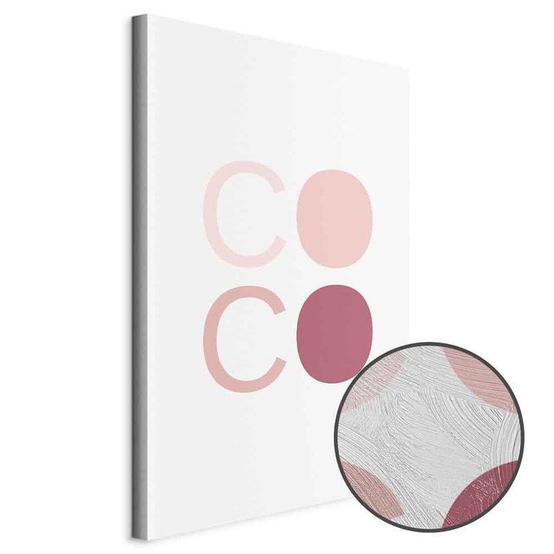
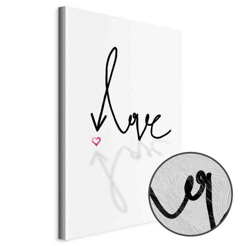
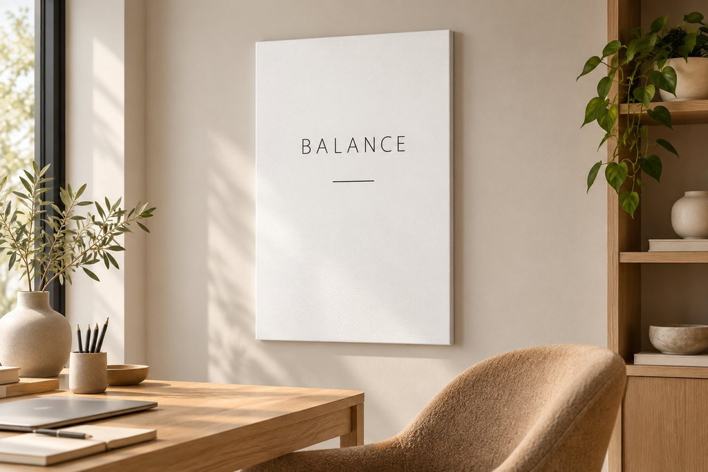
Fine, widely spaced capitals create a different impression from bold block lettering or a handwriting-style line. There are also individual letterforms and symbols that work as graphic images. Compare the balance between lettering and empty space as well as the meaning of the words.
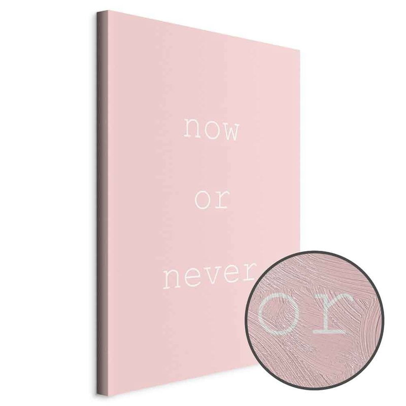
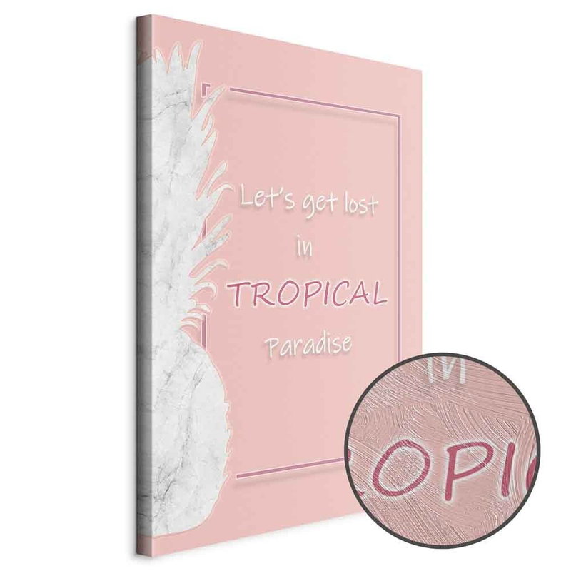
Black on white gives clear contrast, while pink, green and other backgrounds can connect the picture with fabrics and furniture. Some designs combine text with plants, clouds or other illustrations. Choose according to the whole composition so that both wording and background suit the intended wall.
A premium finish with texture over the print
Clear gel is applied by hand over the premium picture’s print to create a physical surface texture. This is a worked print rather than an original hand-painted quotation. Its surface can appear different with the direction of light and viewing distance; the product’s detail images offer a closer look.
The room image helps with placement and proportions. Read each product page for available dimensions and construction. Words in a wide composition and several lines in an upright picture need different wall spaces, and a design that reads easily close up should also be assessed at a normal viewing distance.
Plan for readability and room acoustics
Place the word-based picture where it can be read without competing with too many signs, shelves or small details. In a group, a restrained word design can give space between more detailed images. Consider the gaps between pictures and their shared colours.
The absorbing construction can help reduce reverberation within the room. Its contribution depends on the picture’s area, placement and room conditions, rather than the quote printed on it. Follow the product’s hanging and care instructions and treat the textured gel surface gently.